Task 7.2 Evaluation - Personal

We have reached the final stage of our Advanced Production and the following is an evaluation of the tasks carried out.

The brief of creating a teaser trailer promotional package has allowed us to develop our skills from our AS production.

The initial research we carried out allowed us to understand what makes a teaser trailer and the conventions that need to be met for a particular genre of teaser trailer. These conventions then had to be applied to our production.

The main conventions we discovered about teaser trailers took the form of distinct short clips with quick cuts that were heightened by the select tone and rhythm of the backing music. To meet the genre of a thriller/horror we had to create a sense of suspicious activity for the audience that was closely linked to the lack of identification of any characters featured in the trailer.
Further simple less important conventions of a teaser trailer were the "Audience Approval For" screen at the start of American Trailers and also the end credits which would take up the exhausted phrase of "Coming Soon".

The main product and ancillary tasks have proven to be an effective combination in that our audience made the point that they were able to clearly associate them as a package. The reasons given for this included the identifiable house style which was made up of our selected font which has been used in the inter-titles as well as the name of the product;


From our audience feedback we were able to understand an opinion of our production from a different point of view that would allow us to improve our final product if necessary.
We learned from our audience feedback that we had made good use of our current skills to be able to produce a suitable production that meets the brief and also meets the conventions of the genre we selected as part of this.

However, with regards to considerations for improvements or for future knowledge, we have learnt that we need to spend more time on detailed planning for the actual filming of the production to ensure that we fully take into account anything that might effect us during filming.

Below is the the collated feedback from our audience;


A range of media technologies have been exploited for the research, planning, construction and evaluation of our production.

For the construction part of our production we made good use of the features within iMovie for most of what we needed.
This included the creation of our inter-titles and other font-work which was made easy through the use of the generic controls for fonts which you find in most programs;


Another useful tool within iMovie was the facility to add an effect over the top of an image, such as to make a video black and white or look grainy. We used a video effect for our inter-titles and also for the production company introduction;


A further handy tool that we used a lot within iMovie was the "trim clip at play head" which allowed us to cut our footage accurately and efficiently;


As the course required us to use non-copyright material for our work we decided to use garageband to create a basic music to back the trailer.


We found garageband reasonably easy to use because of the fact that we could easily control the tracks we were using by fading them in and out using the simple fade tool which is the blue dot-to-dot like line you see in the picture below;

Task 7.1 Evaluation - Initial Presentation To Class

Below is our initial evaluation which we presented to the class. This will be developed in more detail in a later post.

Task 6.2 Ancillary Task - Film Poster


1. 2.
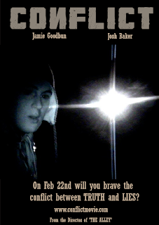
We decided to use the same select image for our poster that was used for the magazine cover.
The house style for the title of the film and font have also been applied.

The conventions for a film poster which we researched and applied are as follows:
  • Clear title
  • Recognisable image or figure from the film
  • Significant Date
  • Website address
  • Inter-textuality
Upon presentation to the class it was noticed that a slight typing error had been made in the design stage of the poster and this has been amended in the second version of the poster (above).

Task 6.1 Ancillary Task - Film Magazine Cover

1. 2.

Image number 1, above, is our first draft for our magazine cover ancillary task. We felt that we had met the conventions of a magazine cover, such as;
  • Distinctive image
  • Clear message
  • Suitable use of fonts and colours
  • Bar code
  • Price
  • Issue Number
  • Website
However, when we presented the magazine cover to our class, they did agree that we had met most of the conventions but didn't feel that it quite looked like a magazine cover.
We therefore decided to amend the design of the magazine and we have selected the second image for use.

Task 4.5 (Planning - Preparation)

Actors
We have currently selected the following actors to appear in our production:

Rob Harnett Ashdon Morgan

Jamie Goodbun Josh Baker

Location
The following locations have also been selected as part of our planning stages to be able to make an appropriate decision:

Kearsney Abbey

Shot Planning
Whilst at the possible locations for our production we tried out a couple of shots that we may use or develop. Below are a couple of examples:

In this shot we have tried to assist the audience in identifying with the location more than the actual actors, which is why the tree is featured in the fore-front of this image.

Task 4.4 (Planning - Script/Outline)

The outline of our production is as follows:

We are producing a teaser trailer for a thriller/horror movie that is to feature short snappy clips with inserts of key tag lines for the content of the film (such as "fear", "horror", "confessions").

The plan is to try and leave the audience asking questions, or cause some sort of confusion so that they will have a mental demand to see the film to satisfy their mind.
For this to happen we will need to use a number of shots such as birds-eye-view, close-ups, extreme close-ups and also long shots.

Task 4.3 (Planning - Photo Animatic)

Here is our Photo Anamatic which we have produced as the next stage of planning from our Storyboard.


On our second draft we will add in the backing music to the video.

I also feel it would be better if some of the shots didn't reveal as much of the actors. This will allow us to make this fit the specification of a "teaser trailer".

Task 4.2 (Planning - Animatic)

Below is the storyboard anamatic for our production:

Task 4.1 (Planning - Storyboard)

Below you can find the storyboards which we have produced as part of the planning stage of our production. The next step is to produce an anamatic of each shot in the storyboard.


Task 3.2 (Pitch - Presentation)

As part of the pitch for our production we presented our ideas to our Media Class.

This involved explaining the following points:
  • Which brief we have chosen and why
  • Choice of genre and why
  • The basic story line
  • Next stage of planning to be carried out
  • Lessons to be learnt - objectives
  • Experiences
We will be able to reflect on this presentation when we present our product when production has been completed.

Task 3.1 (Pitch - Initial Ideas)

The brief we have chosen to do is Teaser Trailer. This is due to many reasons:
  1. We are both interested in films and regularly watch them, so we are able to see lots of trailers in many formats, on the internet, in cinemas and at the start of DVDs.
  2. We feel as though a better outcome would be possible from producing a teaser trailer than a music video because, we wouldn't need to contact an unsigned artist after searching high and low for a band which suits both of our musical interests/preferred genre.
  3. We also have experience of film making during the AS part of the course, when we produced "The Alley". We will be able to develop our skills even further into making the trailer as we have chosen to do a Thriller trailer, as we did for the AS course.
The planning stages which we have had to go through are as follows.
  1. Ideas - choosing genre, storyline, characters etc..
  2. Anematics - Storyboards (both drawn and photographed)
  3. Synopsis of the whole film to make it easier for us to piece the film together and help to make the trailer make sense. (Basic storyline)
  4. Script of the trailer (not the whole film)

Task 2.2 (Production Company Logo Design)

Task 2.1 (Production Company Background)

The production company is responsible for both the development and physical production of new media, performing arts, film, radio or television program.

Therefore the logo's of these companies are normally significantly noticeable at the start or end of a production. As the film industry develops, so do the logo's of production companies.

Columbia Pictrues was founded in 1920 by Jack and Harry Cohn and Joe Brandt. They were bought out by Sony in 1989, at the time it was a growing trend for Japanese companies to buy American firms.

Before the purchase their logo was:


After the purchase, Sony re-named the company "Columbia Tri-Star" and a new logo was developed to reflect this:


Walt Disney Pictures, the film banner, was established as a designation in 1983, prior to which Disney films since 1954 were released under the name of the parent company, then named Walt Disney Productions.

Their logo has always been a simple Castle on a blue background, with Walt Disney's signature as the font for the name:


As you can see from the picture below, the logo for Walt Disney has now developed into a much more graphical design.

Task 1.1 (Research - Initial Trailer/Short Film Analysis)

For the purpose of this task I have selected to use the official teaser trailer for the Twilight movie.


Change of Plan!

During the planning stages of out advanced production we decided to switch to a different brief.
The main reason for this was so that we could continue our learning and develop our knowledge from our AS production.

We have therefore changed our brief to a "Promotional Package to include a teaser trailer....".

I have decided to leave in my research for the music video production but will now begin the research for our new brief.

Task 5 - (Research - Michael Jackson's 'Scream')


Michael Jackson's "Scream" video is still recorded as the most expensive music video ever made - at a total cost of $7,000,000.

An analysis is going to be made of the representation of gender and sexuality in this video through mise-en-scene. Textual analysis and Goodwin's six areas of analysis will be used for the investigation of these representations.

Task 4 (Research - Music Promo Research)

This part of my research will cover the textual analysis and Goodwin's six areas of analysis across a variety of music video genre's.

The first being Black Eyed Peas - I Gotta Feeling:


This video from the Black Eyed Peas fits into the genre of Pop/Hip-Hop.

Textual Analysis
Camera - The majority of this video is filmed in medium shot with occassional use of close ups and long shots. The use of medium shot allows the audience to keep good understanding of movement and to be able to notice the sex appeal of the dancers - typical of pop music videos.

Light - Large amount of light during the first half of the video allows the audience to clearly identify the artist. The use of light takes a turn in the second half of the video where it turns dark and neon lights are used which enhance the party atmosphere which is the main element of Pop/Hip-Hop songs.

Mise-en-scene - The props used in the opening of the video allow the audience to associate with getting ready to party.... Shower/Make-Up/Hair. The whole party idea is what makes Pop and Hip-Hop songs.

Goodwin's Six Areas Of Analysis


The next video is Metro Station - Shake It


Textual Analysis
Camera - Most of this video has been filmed in either medium or long shot - giving the audience the ability to view the "modern rock dancing" featured in this video. The medium shot also allows the audience to note the clothing that the band are wearing - common of Rock bands.

Lighting - This video is filmed without much light which is fairly common of Rock music videos and could be considered a key convention to not make use of much light but to raise concentration on the music instead.

Mise-en-scene - The clothing being worn by the band is common for Rock fashion, the clothing being worn by the dancers in the video helps to modernise the scene.

Goodwin's Six Areas Of Analysis

Task 3 (Research - The Growth of Music Videos)

The following is a time-line that shows the introduction, changes and growth of music videos.

1940 - Soundies

The 'soundies' are an early form of music video. Produced in New York, Chicago and Hollywood these films were three minutes long and normally consisted of short dance sequences.

These early version music videos were shown on coin-operated jukeboxes in clubs and restaurants.

'Soundies' covered all genres of music although they were especially popular for playing a part in the spread of African-American artists who found it difficult to publicise their work on other public mediums.

Here is an example of a 'Soundies'music video;
"Zig Me Baby with a Gentle Zag (Featuring Gai Moran and Danny Hocktor"


--------------------------------------------------------------------------

1961 -
Ricky Nelson

During 1961, Ricky Nelson's "Travelin Man" video is shown on television. The short film made to promote the video is considered the first music video.


--------------------------------------------------------------------------

1962 - New form of music video for television

In 1962 television production companies invented a new form of music television. They created programs such as "Top Of The Pops", "Ready! Steady! Go!" and "Oh, Boy".

These programs allowed artists to come on and promote themselves. The shows started as band vehicles but soon became a huge hit across the country.
--------------------------------------------------------------------------

1970 - Great Opportunity

The record industry discovered that the aforementioned TV shows provided them with a great opportunity to get artists noticed. The record industry began to produce many short "Promos" which could be featured on television instead of some live performances.
--------------------------------------------------------------------------

Task 2 (Research - Genre Comparative Study)

First of all, here are the two music videos that I am putting forward for comparison with regards to the six stages of analysis.

T.I - Live Your Life ft. Rihanna


Flo Rida - Sugar Ft. Wynter Gordon


------------------------------------------------------------------------------

Both of the above music videos follow quite closely the conventions for Hip-Hop music videos, thus being mostly telling some sort of love story in an "american" fashion. Other conventions could be considered as the dancing styles etc. that we also witness in a lot of music videos of this kind.

These two videos approach the link between lyrics and visuals in seperate ways.
Flo Rida makes few links between the lyrics themselves and the visuals. The only like that can be made in this video is some of the shots that show the lyrics being sung. A possible link is the shots that show Flo Ride being pampered by the girl he calls "Candy".

T.I makes better links between lyrics and visuals. The parts where Rhianna is singing about being a "shining star" and having "fancy clothes" is what she is herself just getting ready to become as she is just about to go on stage and sing. There are also visuals that support the story T.I is telling about the current affairs of his life.

The next stage for analysis is the links between music and visuals.
This is something that Flo Rida has approached very well. He has used a number of shots that feature a speaker in the background that is pumping to the beat of the music. This can allow the audiece to link together the beat that they hear with the beat that they are watching visually.
Again, T.I has approached this stage in a different way in that most of his cuts are done at each bar of the song, this is normally when the next line is sung.

Promotion is something that is extensively noticeable in both of these videos. They heavily feature the main artists.
Flo Rida may find that his music video promotes him better because his video contains a higher amount of sex appeal.

This leads me nicely on to voyeurism, which obviousy Flo Rida has achieved quite well. Although there is a suitable amount of voyeurism in T.I's music video, i'm not sure if it will be enough to attract as larger audience as Flo Rida's video could.

Task 1 (Research - Initial Six Stage Analysis)

Lady Gaga - Paparazzi


This music video takes up some of the conventions for pop videos and the main one being the sex appeal of the lead singer. This comes across strongly throughout the video.

There is a clear link between lyrics and the visuals being presented to the audience. The main message being presented is the role the “paparazzi” play in the world so there are a number of insert shots of newspaper articles and there is even some camera views through a photographers camera lens.

The music also has a distinctive link to the visuals. At first there is an unusual opening to the song in that there is no music to go with the visuals to begin with, instead this silence and only dialogue allows the dialogue and visuals to be enhanced. There is also an idea that the beat of the music that starts off a rhythm if you like for some of the camera cuts.

Lady GaGa is featured throughout the music video and this helps with the main job of promoting herself and her new song. The video also helps her to create the image she wants to be perceived by the audience. There is a slight twist within this music video, in that the video is actually a story of how Lady Gaga maybe doesn't want to be promoted.

I think that the artist has deliberately used a large amount of voyeurism for the audience; her sex appeal will attract a larger audience than most moderate music videos. There is also voyeurism within the music video, where the paparazzi are smothering her with their cameras once she fell of the balcony.